Projection Photography
 |
| Example 1 |
 |
| Example 2 |
How did I do it?
These two images are examples of 'projection' photography. I did this by using the following:
- A computer
- A camera
- A projector
- A white background drop
- A photo to project
- A model
- A tripod (optional)
Once I took both of these images I uploaded them to Photoshop.
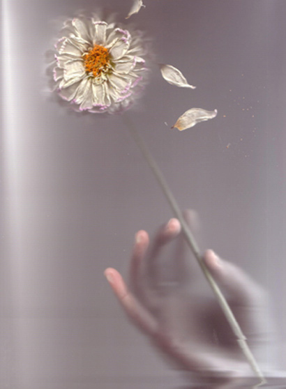
What did I do? (Example 1)
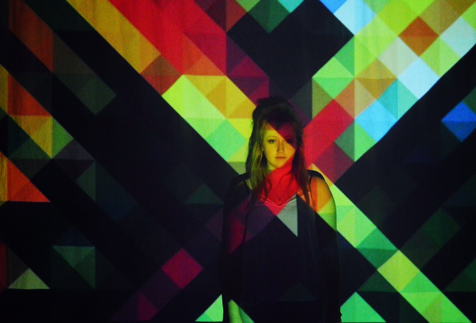
Firstly, I cropped the image to get rid of the unwanted bits that I didn't want. I then changed the 'brightness/contrast' on the 'adjustments' panel to '22%' and 39%'. After that I then moved onto the 'photo filter' and changed the 'density' right down to '1%'.
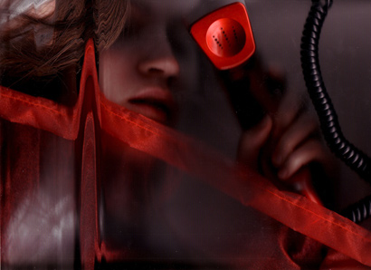
What did I do? (Example 2)
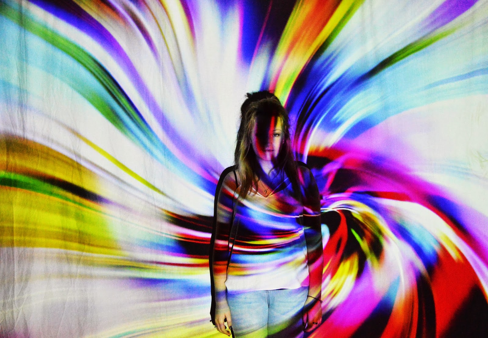
Firstly, I changed the 'brightness/contrast' to '26%' and '91%'. This is purely because without that change the original photo is just completely dull and boring. After that I then moved onto the 'hue/saturation' and changed both of them slightly up to '+4%'.
Evaluation (Example 1)
Likes: What I like about this image is the colours that is being projected. This is purely because the colours come across very 'calm' as they're not too overpowering and vibrant.
Dislikes: What I dislike about this image is that the projection is slightly too dark in places.
What I could do better: What I think that I could of done better would be the change of the model's position and pose.
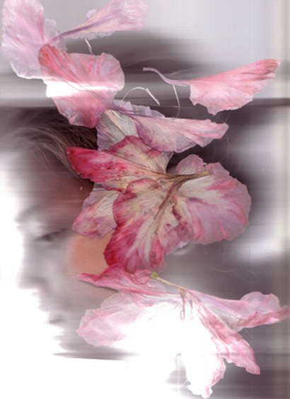
Evaluation (Example 2)
Likes: What I like about this image is how the pattern seems to swirl into one place with the bright, vibrant colours making it stand out even further.
Dislikes: What I dislike about this image is that you can't really make out what the model look likes as the colours are too overpowering on the face.
What I could do better: What I think that I could of done better would of been to try and un-crease the background drop as that simple mistake ruins the picture completely.
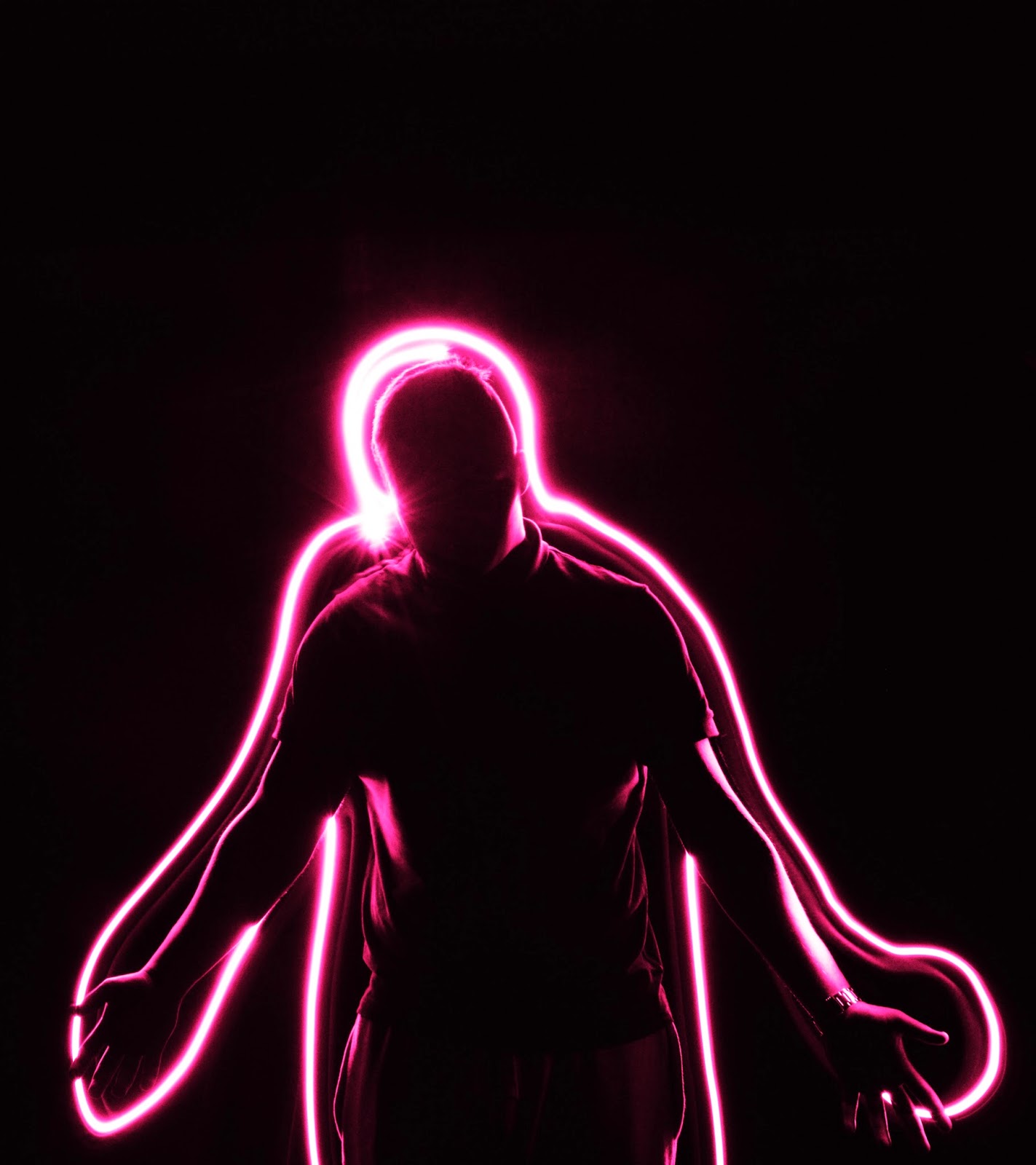
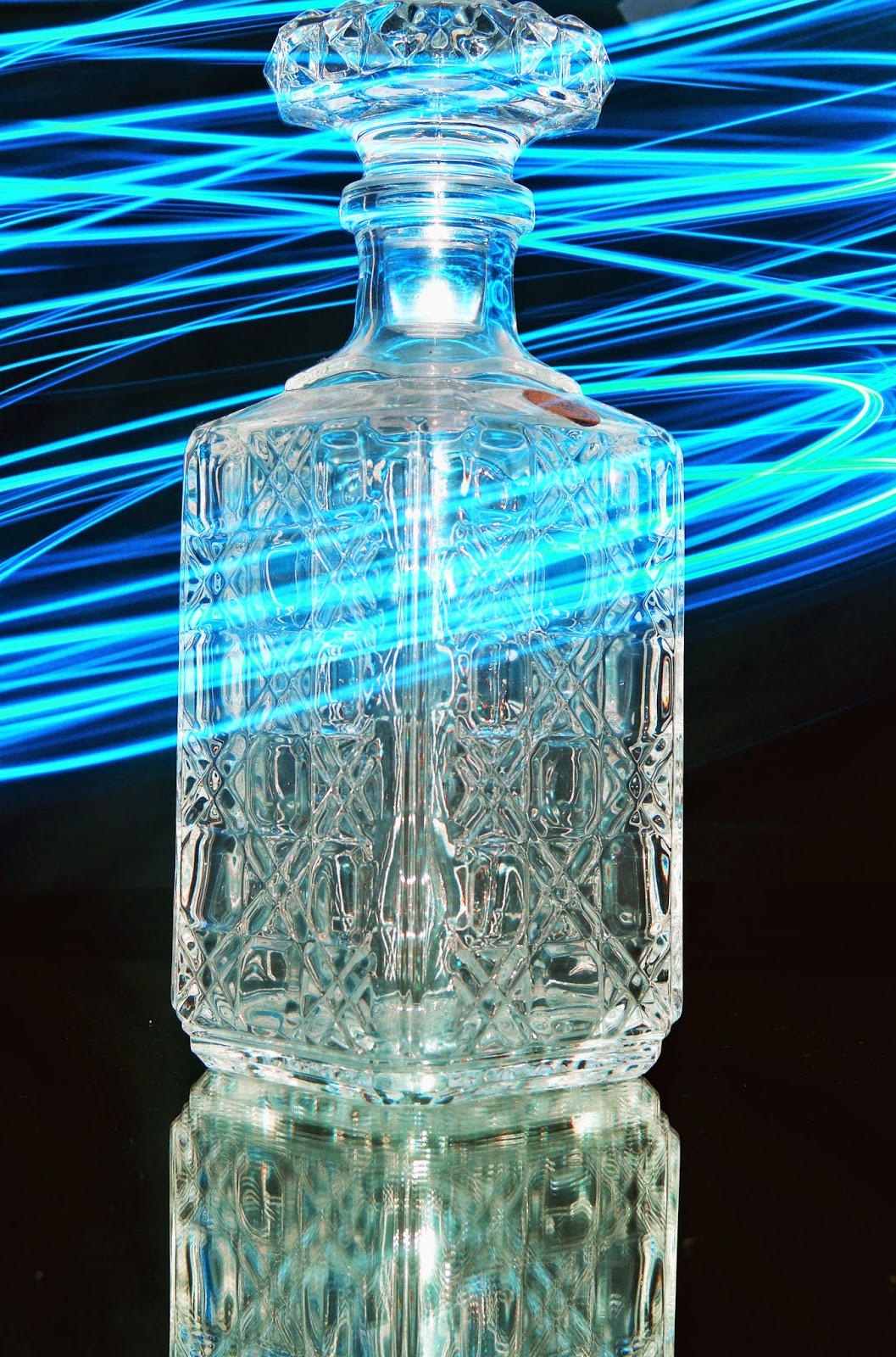
Light Painting
 |
| Example 1 |
 |
| Example 2 |
How did I do it?
These two images are examples of 'light painting' photography. I did this by using the following:
- A camera
- A black background drop
- Torch
- Model/Item
Once I took both of these images I uploaded them to Photoshop.
What did I do? (Example 1)
Firstly, I cropped the image to get rid of the unwanted negative space. Once I did that I then moved onto the 'brightness/contrast' on the 'adjustments' panel and changed the contrast right up to make the background appear more darker. Thirdly, I then moved onto the 'colour balance' this is then where I changed the colour of the torch into a pink colour by moving it down to 'magenta' . I did this because the original colour of the torch was a dull, yellowy colour which didn't look nice.
What did I do? (Example 1)
Firstly, I went to the 'brightness/contrast' and changed the contrast right up to get rid of the unwanted bright bits which should of appeared black. Secondly, I changed the brightness slightly higher to make the glass more noticeable and clear. Once that was done I then moved onto the main focus, light painting. I firstly messed around with the 'hue/saturation' and changed them both up slightly. After that I then went onto the 'colour balance', this is where I changed the colour of the light painting which you can see circling around the glass. The original colour was a dark, dull blue colour and with the 'colour balance' I turned it down to 'cyan' this then made the dark, dully colour appeared more light and vibrant. Lastly, I then changed the layer from 'normal' to 'luminosity'.
Evaluation (Example 1)
Likes: What I like about this image is the colour of the light painting which goes around the model's body.
Dislikes: What I dislike about this image that the image doesn't really have anything to do it apart from a simple outline.
What I could do better: What I think that I could of done better would of been doing the outline more better by taking my time and go into every single detail as possible to give it that greater effect.
Evaluation (Example 2)
Likes: What I like about this image is how the light painting spirals around the glass.
Dislikes: What I dislike about this image is that there is hardly any light paint.
What I could do better: What that I think I could of done better is focus more on the actual technique than making the actual picture look nicer with different things.
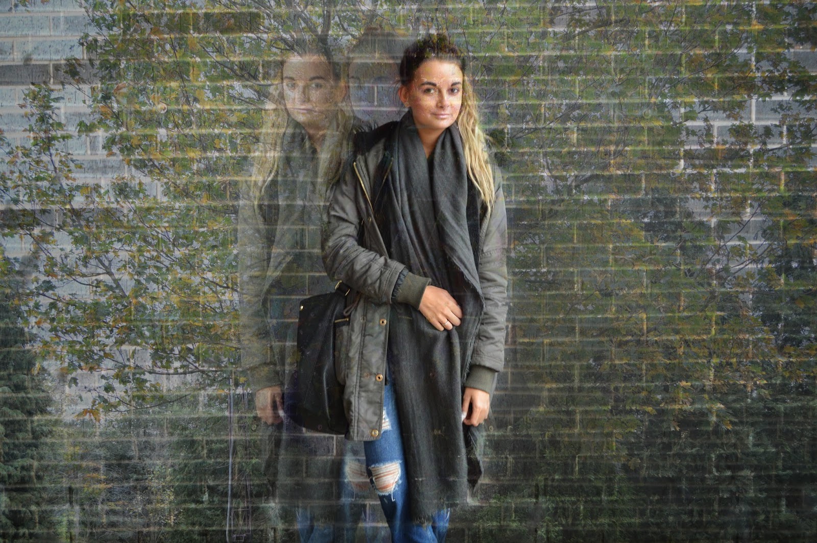
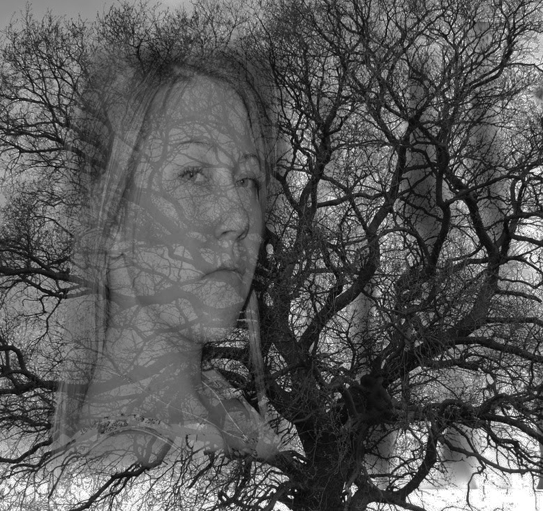
Double Exposure
 |
| Example 1 |
 |
| Example 2 |
How did I do it?
These two images are examples of 'double exposure' in photography. I did this by using the following:
- A camera
- A model
- Outdoors (tree)
Once I took both of these images I uploaded them to Photoshop.
What did I do? (Example 1)
I got this image by editing two single photos which I had taken separately. One photo was of a model stood in front of a brick wall and the other of a tree on the college campus. I first uploaded the photo which I would like as my background and that was the tree image. Secondly, I uploaded the other and dragged that over the following one I uploaded first. Thirdly, after that was done I then moved on and changed the 'opacity' to '51%' and kept the 'fill' the same at '100%' which then led me to my final image of a double exposure but I wanted to make it more interesting so I duplicated the picture of the model twice by putting one beside the original picture of the model and one in between. After that, I used the 'background eraser' tool to blend the model x2 further in the background whilst leaving one to stand out.
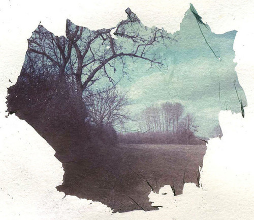
What did I do? (Example 1)
I got this image by editing two single photos which I had taken separately. One photo was of a model which I had taken in the college studio in front of a black background drop and the other was a picture of a bigger tree that I took in the park. Firstly, I uploaded the photo which I wanted to be as my background (tree image). I cropped the image to give it more of a square, smaller look than a long, rectangular look. I then changed the colour of the image into the black and white effect. Once I did that I then focused on my other image which I also uploaded into Photoshop. When uploaded, I went around the model using the 'background eraser' tool to get rid of the the black background so I then could drag it over to the first original picture that I uploaded first. I then changed the 'brightness/contrast' to '97%' and '-50%' Last and least I then moved onto changing my 'opacity' to '80%' leaving my the 'fill' at '100%' still.
Evaluation (Example 1)
Likes: What I like about this image is that it has a 'dreamy' mood to it. I think it gives you this impression because it has a picture of the model x3 in the photos that fade further and further in the background expect one (the original).
Dislikes: What I dislike about this image is that you can notice a brick wall in the background as well the original background of the tree where I didn't remove the background behind the model.
What I could do better: What I think that I could of done better is to made the background of the tree a little bit more noticeable and stronger than the picture that lays over it.
Evaluation (Example 2)
Likes: What I like about this image is where it has no colour effect apart from black and white.
Dislikes: What I dislike about this image is that it is a bit boring because it hasn't got anything to it.
What I could do better: What I think that I could of done better is using a different background to make the image more interesting and not similar to the first example.